REDESIGNING PRODUCT FOR A LEADING PROPERTY DEVELOPER
DESIGN SYSTEMS
UX EXPLORATION
UI EXPERIMENTATION
OVERVIEW
DISCLAIMER: In order to protect client privacy, the full extent of the project will not be disclosed and designs have been altered.
Customers at the helm
Along with the lead designer I had to figure out a way for customers to navigate the website in ease and get to the information they want immediately.
Shop-lifting
Along with the lead designer I had to Buff up the product's look and feel to align with the new brand direction and increase traffic for customers.
Role
Product designer - UX/UI Conceptualisation, UX/UI Research, UX/UI documentation, workshopping with stakeholders, interaction design, creating variable components, adding components to design systems, rapid prototyping
Team
R.W - Project manager
M.O - Lead Product designer
Me - Product designer
Timeline & Status
Jan 2024 - March 2024 (3 months)
Tools Used
PROBLEM
●
●
●
SOLUTION? (DRUM ROLL PLEASE)
●
●
●
HIGHLIGHTS
COMPONENTS SHOWCASE
INTERACTION DESIGN
PROBLEM
Context I had before the workshop. The digital experience had not been update in 10 years and was missing a lot of best practice UX elements. Navigation was very cumbersome and information was stagnant.
No power to the people: Their current experience did not have any powerful way-finding tools. You had to exhaust the mega menu just to find a single store.
A website that's slowly dying: The customers were visiting less and less. This is bad for the business at it mean there will be less traffic to the store.
No alignment on brand: To bring p to chops decade old product that did not align with the current brand. There were not many best practice UX elements.
GAME PLAN
North-star
Doing it the frog way
Create a journey as if it was an exciting story and replay it back to the users and customers the same way.
Out of the box thinking
Bring in ideas that can tackle a purpose well but just crazy enough to make a difference.
Quality Assurance
Bring designs consistent with their design system, multifaceted, developer-friendly and documented well.
APPROACH
We figured it was best for us to talk directly with clients so that we can gain a deeper understanding of the overall landscape so myself and the lead designer set up multiple design workshops where we divided the activities to make and facilitate so clients can raise any flags and request for the new experience.
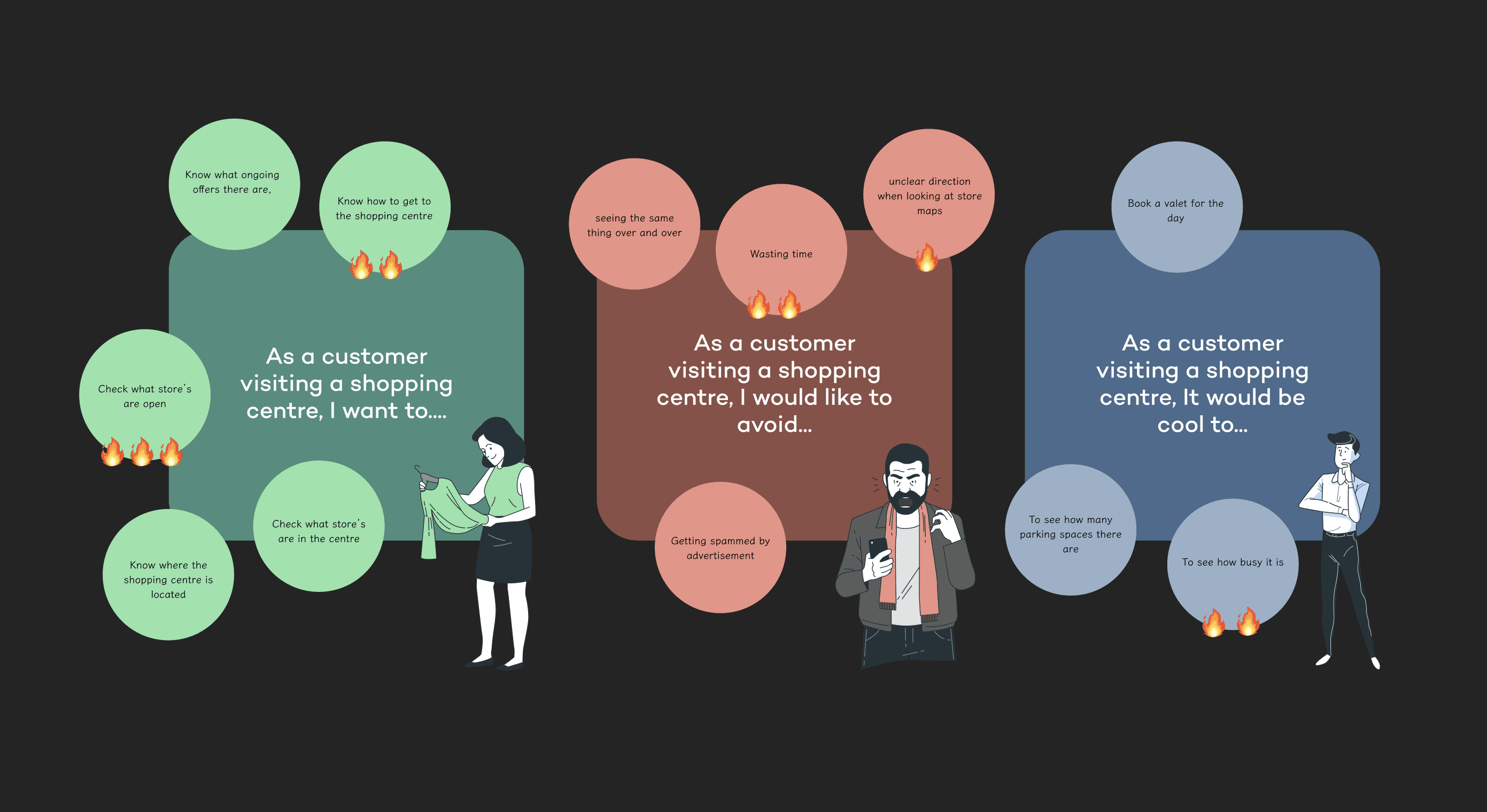
We set up some bubbles of the user goals that would commonly factor into the visiting the experience with the help of a stakeholder that managed the analytics. Then we made the stakeholders highlight the important ones.
Let me find things quickly and easily
Find opening and close times
Find a store
Find offers
Locate a store
Navigate the centre
Keep me updated on matters regarding the centre
Information is live
Information is updated
Information is consistent
Information is accurate
Along with their own concerns and requests the clients also raised some issues directly faced by their customer.
Their current experience was not at all bad by any means but they were missing a lot of UX best practises elements such as hierarchy and alignment. Information was also inconsistent and was a tad difficult to navigate around.
Either there was a dead end the flow or there wasnt a clear starting point users could begin with
A Treasure hunt for most
The internal architecture was messy and forced users to exhaust the mega menu.
Offers and events were not accurate
Information was very static and inconsistent. Sometimes even going missing.
FOCUS POINT 1
Information front and centre, keep it simple and quick.
Through the research we found a heavy emphasis on the simple things.
FOCUS POINT 2
Easy navigation for an easy experience - remove any complexity
These were concerns raised by both stakeholders and users of the product
GAP / EUREKA MOMENT
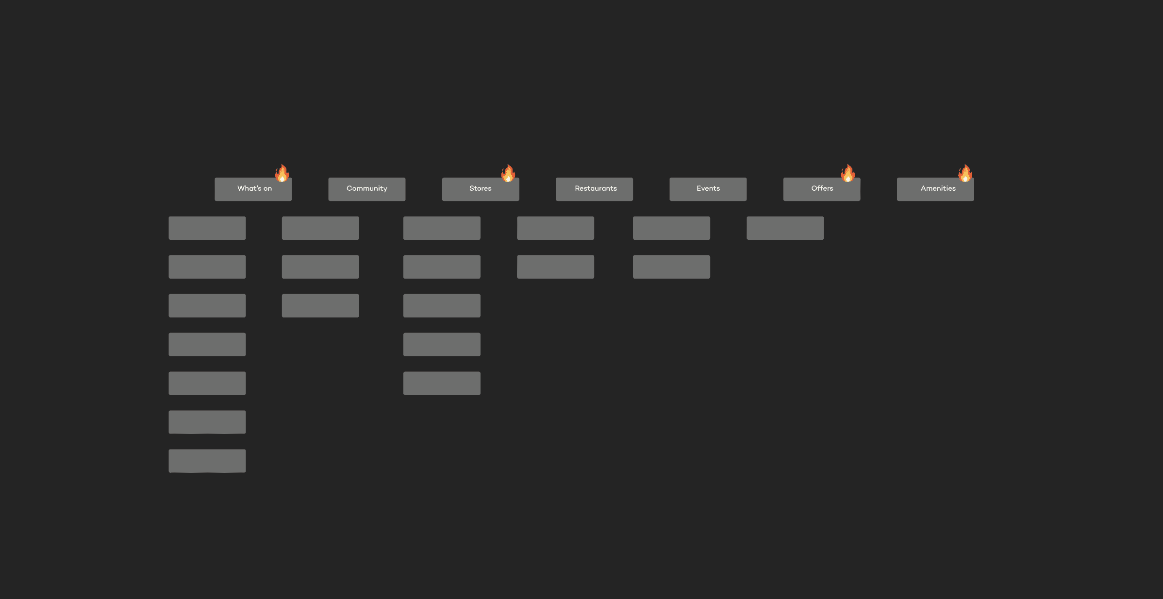
Their current architecture had seven main headings with content attached to it. It separated into the categories of what's on, stores, restaurants, events offers and amenities. It did not really follow a theme.
SNIPING FOCUS POINT 2
Following the inputs from the user goals and pain points from the analytics stakeholder, we also asked what were the most vital contents were to them from a business standpoint. What is most important for customers to see?
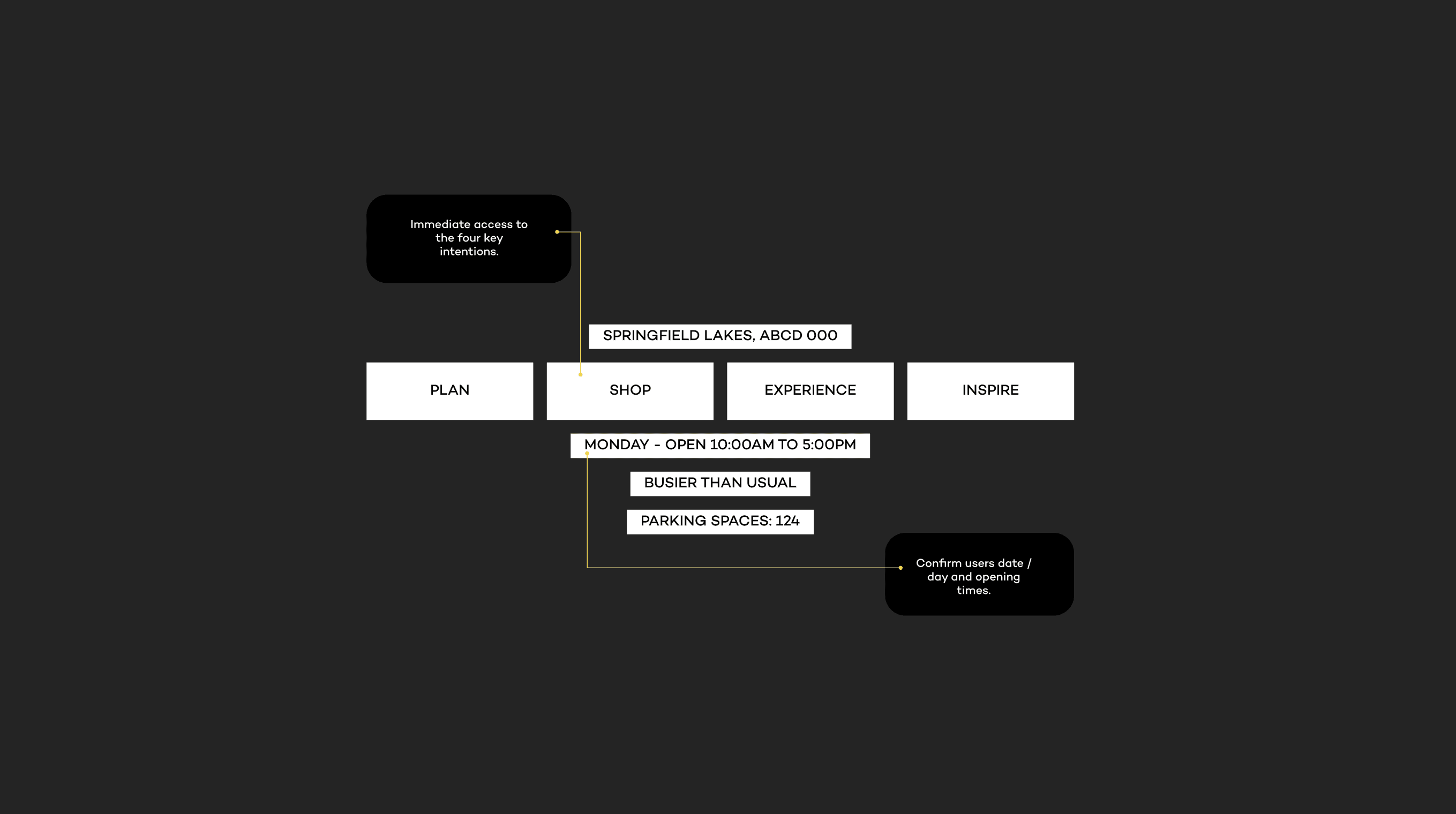
Plan your visit: Information on centre opening times and directions. Questions: Where is the centre located? What time is it open?
Shop in store: Store listings, opening hours, and navigation within the centre. Questions: What stores are in the centre? When are they open?
Experience: Other activities and events within the centre. Questions: What events are on at the centre?
Inspire: Content generated by Client A. Questions: Where can I find recipes?
GAP / EUREKA MOMENT
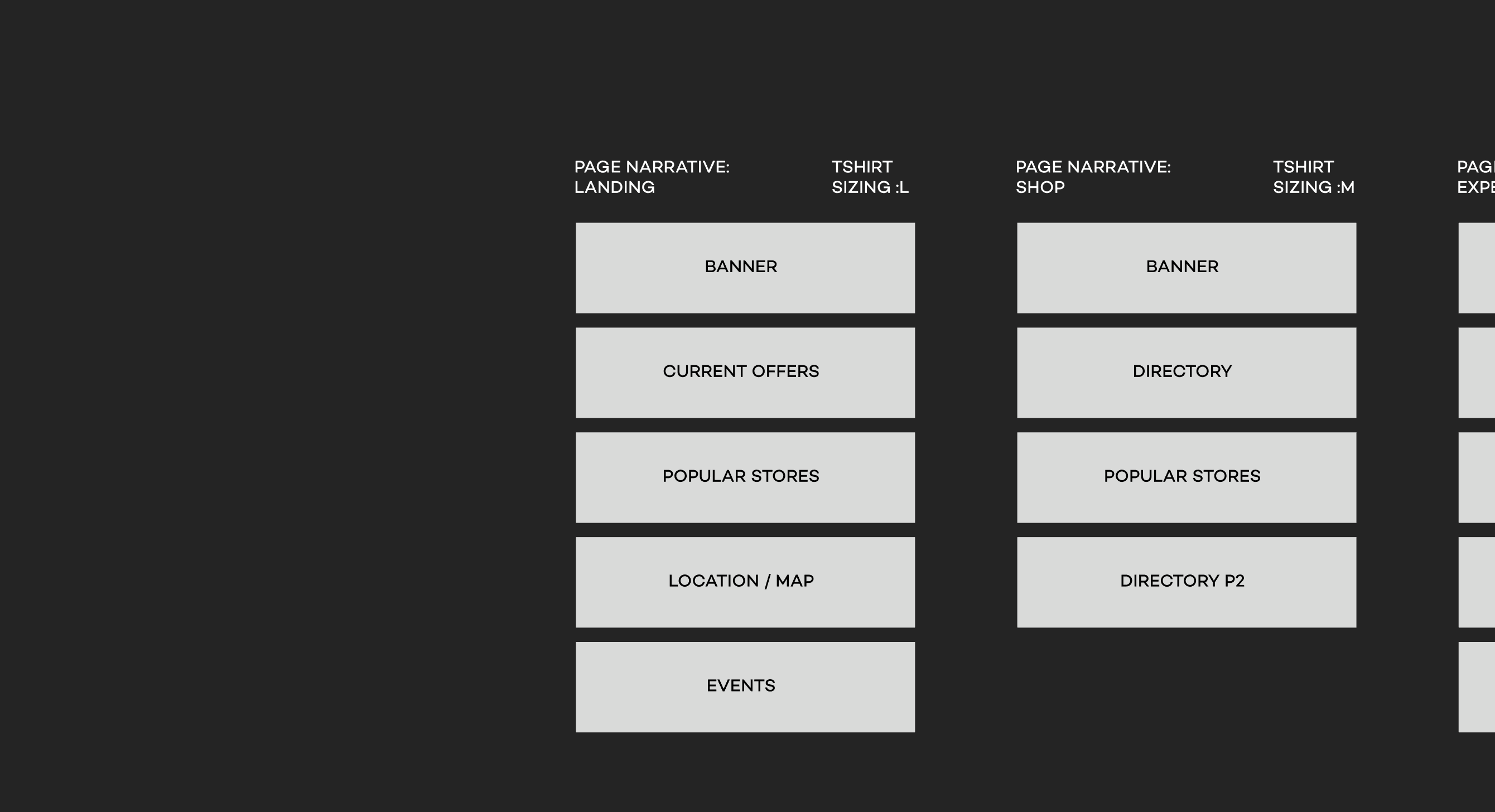
Myself and the lead designer figured it was good to split off and tackle the other deliverables of the project. They, being more experienced with the redesign focused on setting up page narratives whilst I will focus on ideation regarding solving their pain points.
SNIPING FOCUS POINT 1
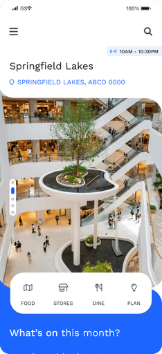
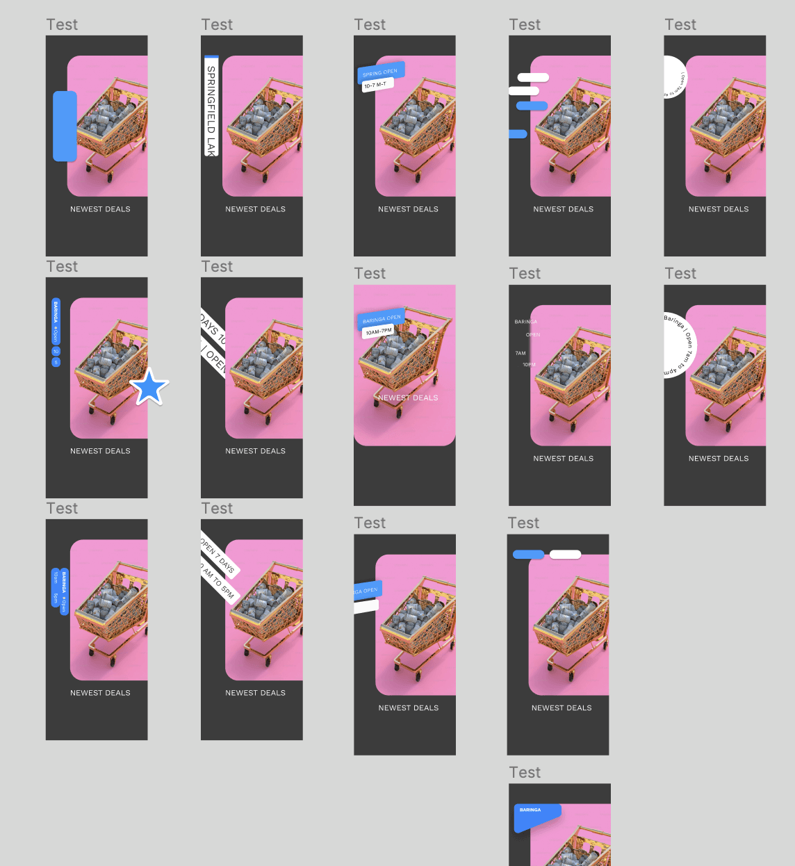
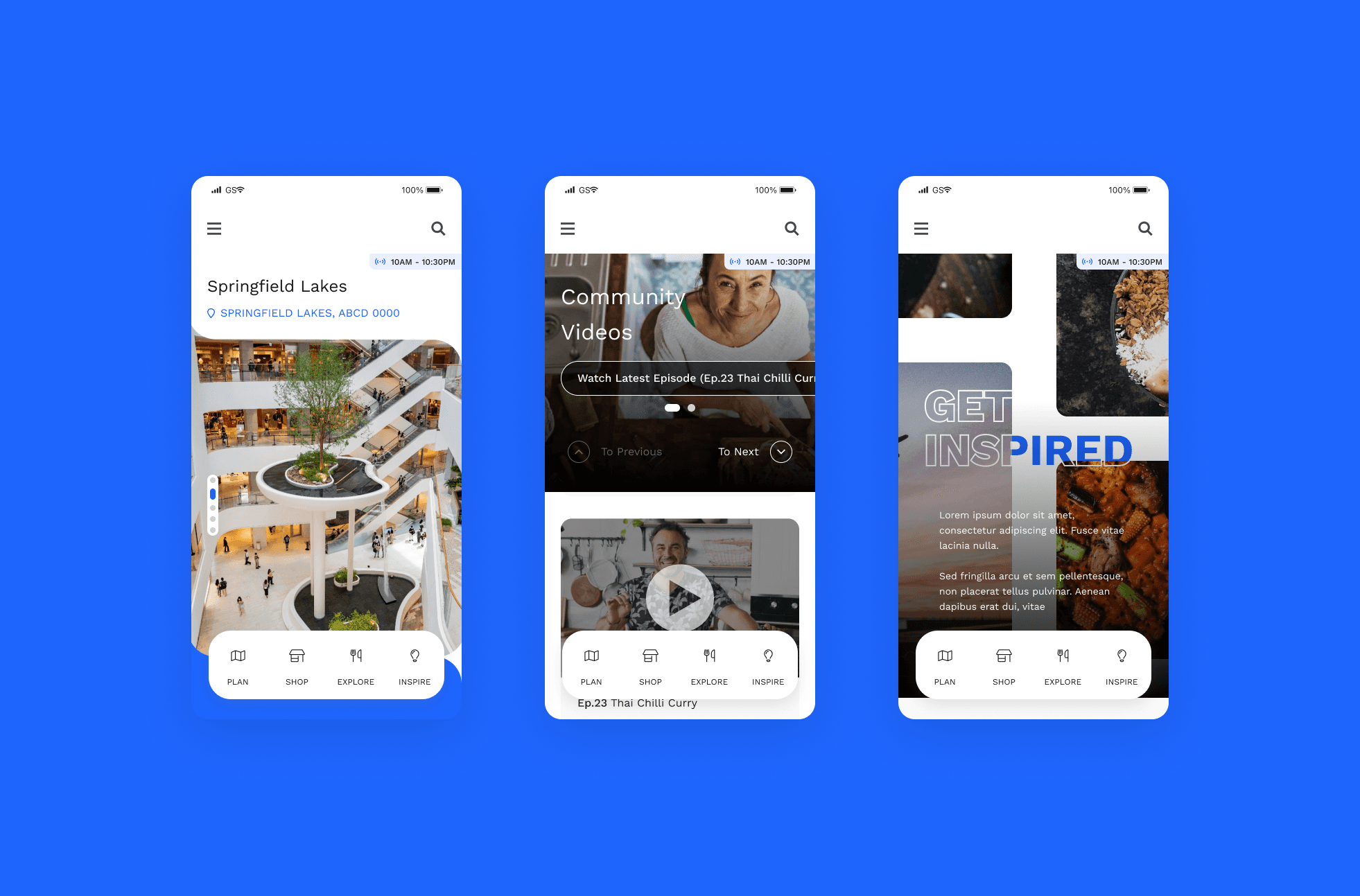
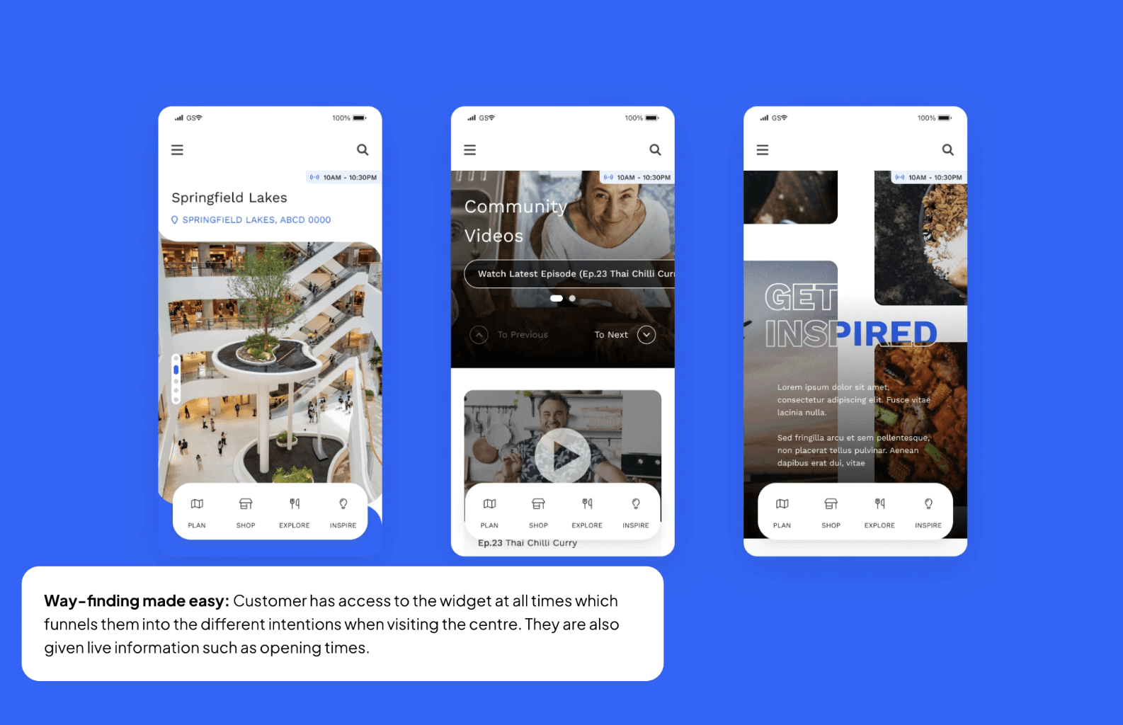
Having purchased the newest iPhone. I had really been into the idea of the dynamic island as a way to quickly get information without disturbing the overall peace. I asked the lead if it was okay for me to implement this style
Ideally i'd wanted a swiss-army knife style widget that encompassed dynamic information as well as the four key intentions with extra stuff added. I took this very low fidelity wire-frame and showed it to the developers.
Honestly it was good for me to check with the devs before doing any further design. I also opted to not include location as it will be too much content and will just push them to be more confused.
GAP / EUREKA MOMENT
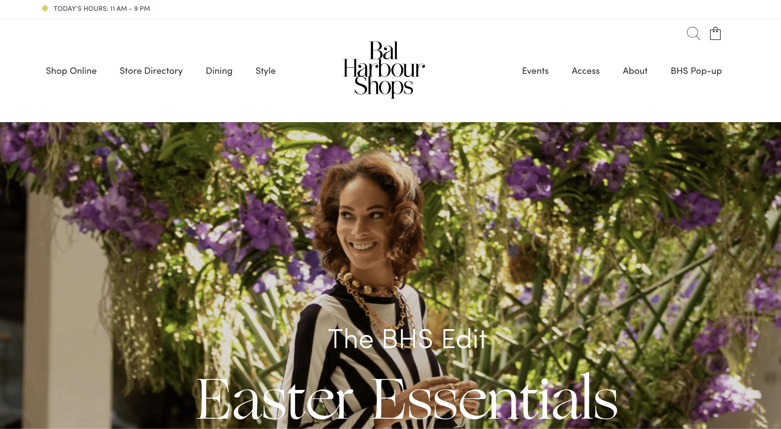
There was a new brand direction that the company wants to implement throughout their eco-system that boated fun and chic. A marketing stakeholder said it was the way to get people more engaged with content and drive ocnversion
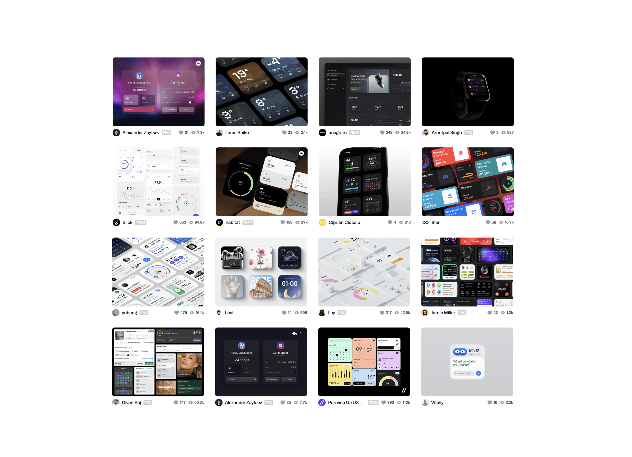
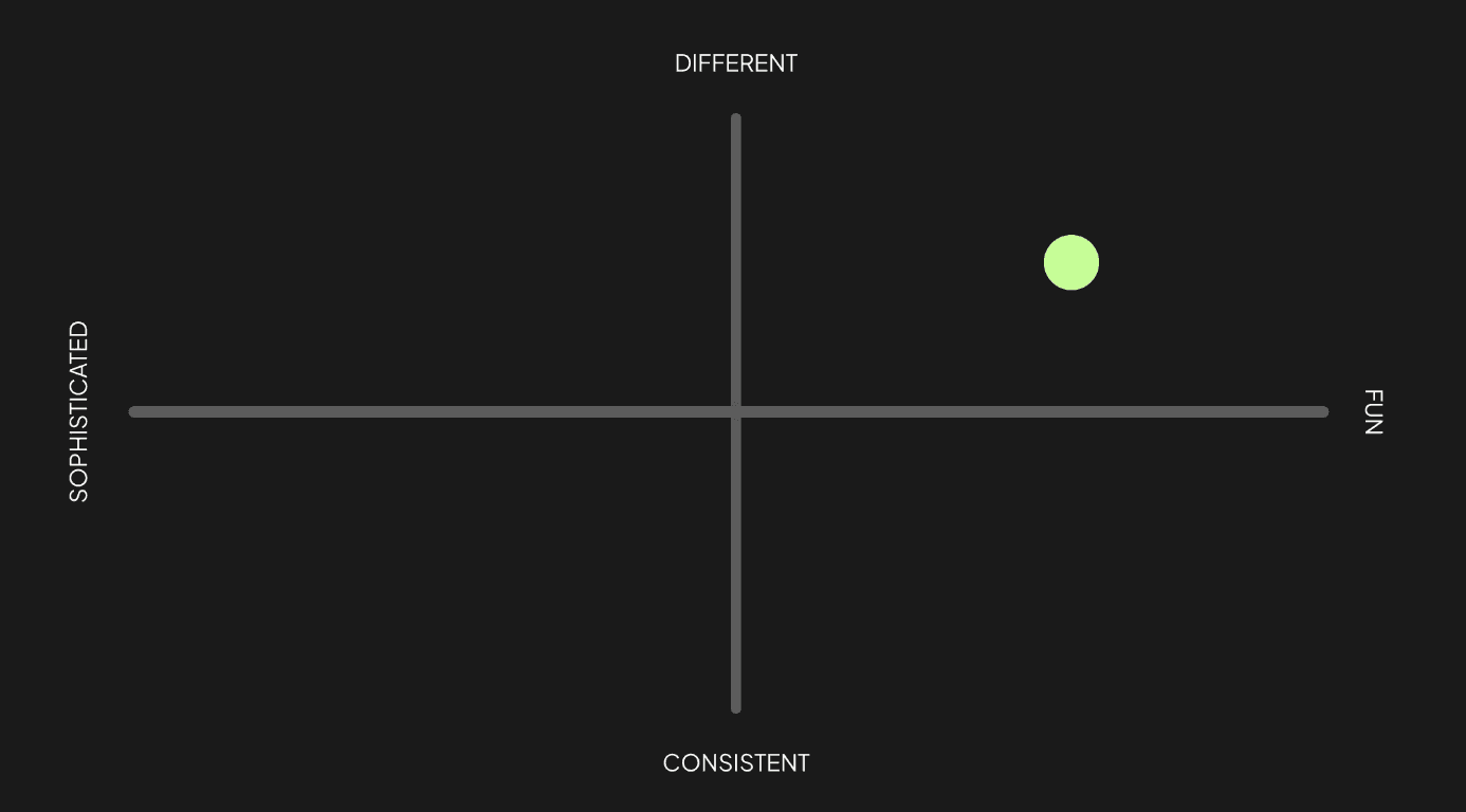
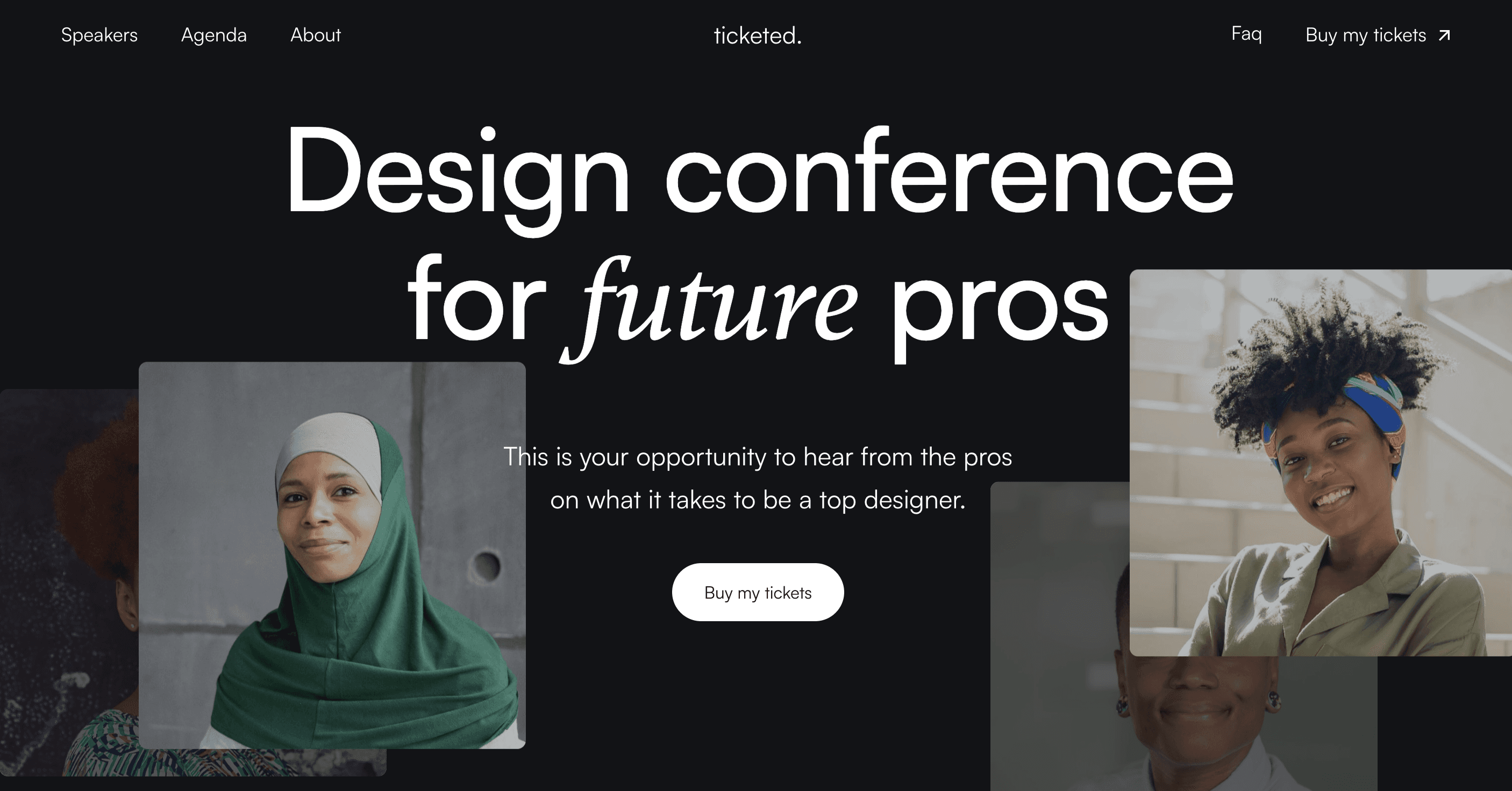
I consulted with the other frog designers to ask if it was okay for me to show them websites i thought were cool that was outside of retail they said it was a smart idea since a lot of retail websites are the same and it really hit the mark on being different.
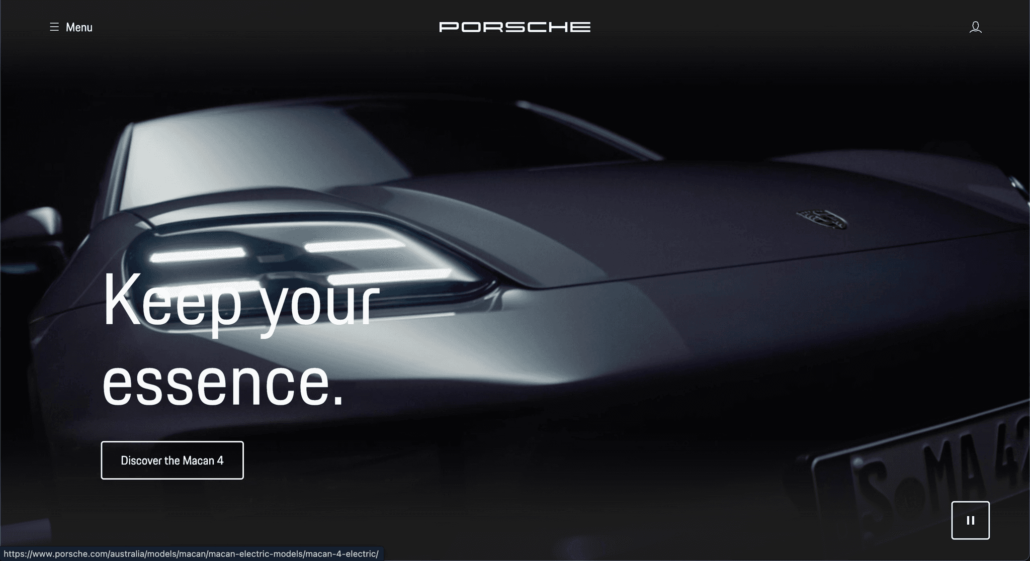
One example was Porche's landing screen which had a clear focal point they wanted the customers to focus on highlighting a specific product. I was thinking this would be good in showcasing a featured store.
Funky interactions.
They enjoyed when there were cool animations and interactions between elements such as takeover scrolls.
In Your Face Visuals
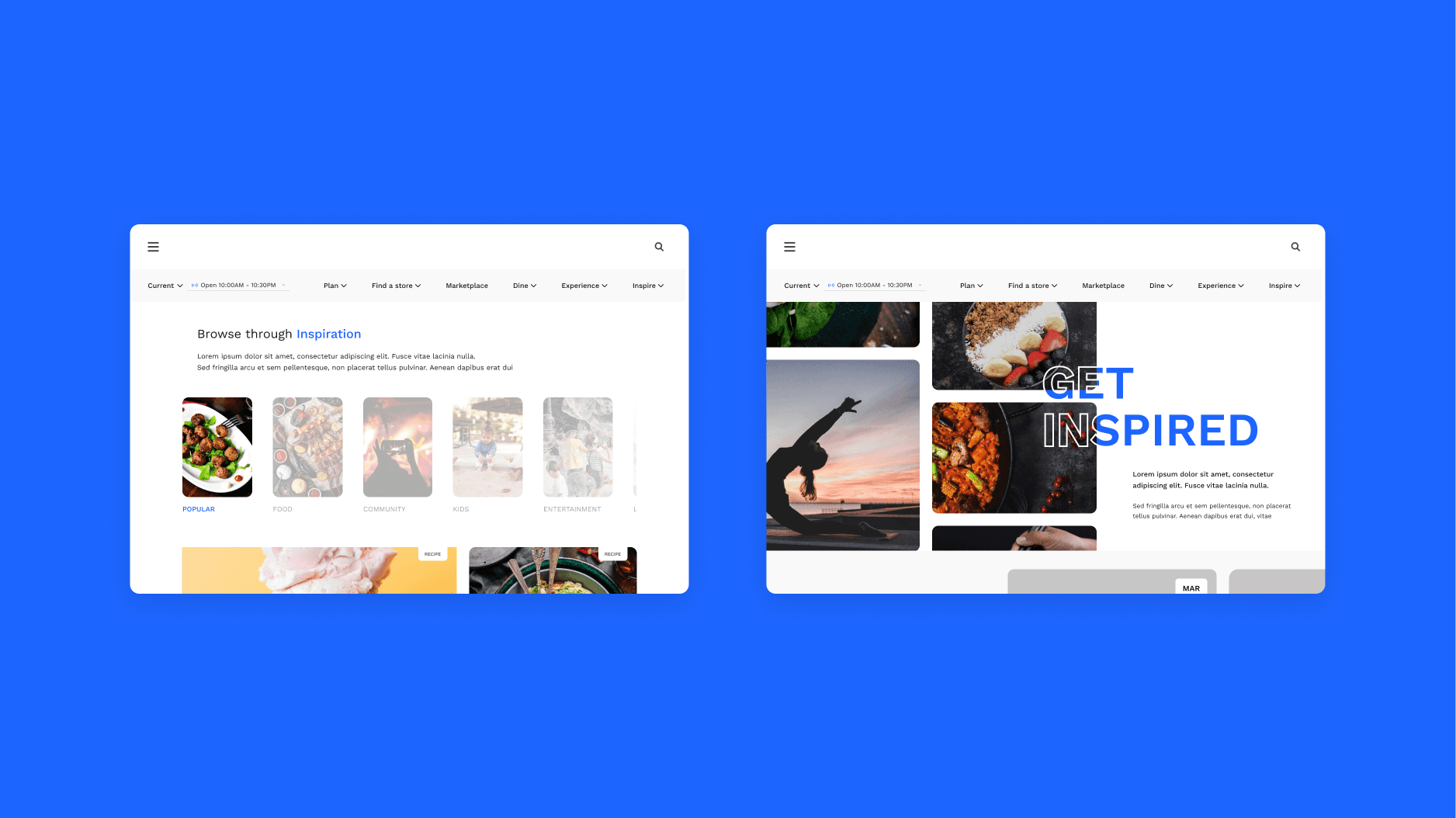
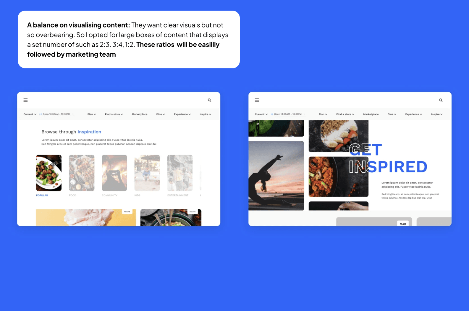
When something was too big or in your face, the stakeholders felt it was a bit jarring and would like to avoid it
More details on certain pages
Although the visuals and interactions were nice they wondered how the information from their product would translate in this look.
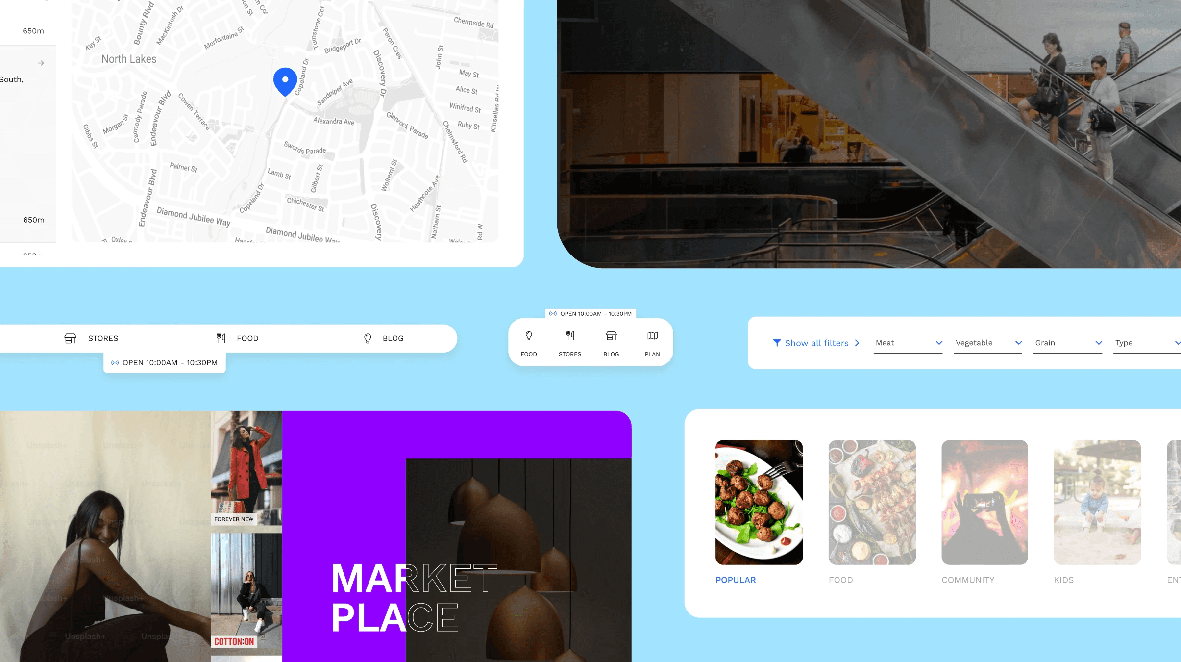
Playing around with widgets looks
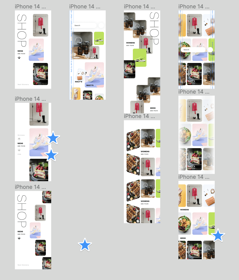
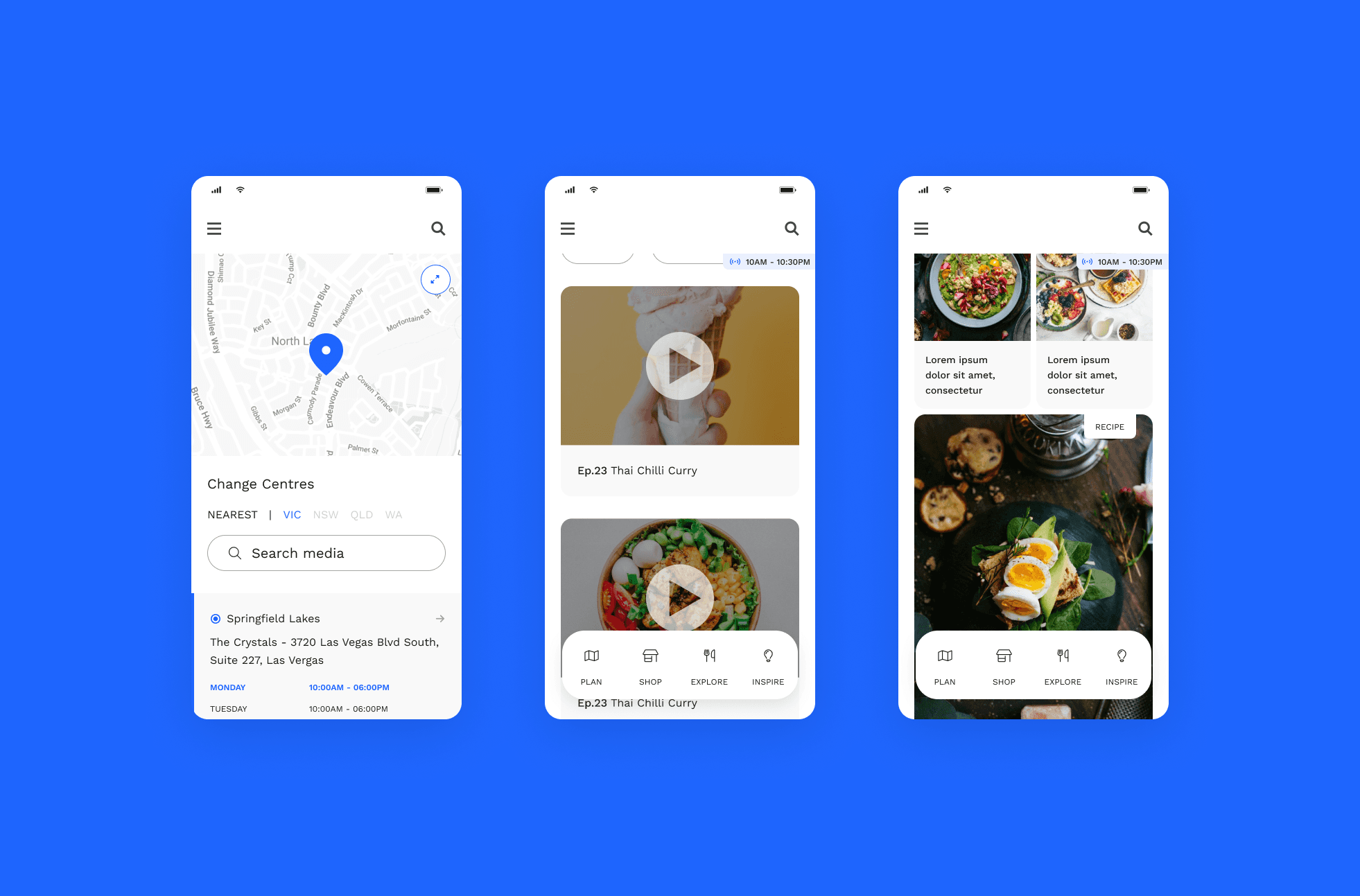
Concepts on content display/ gallery
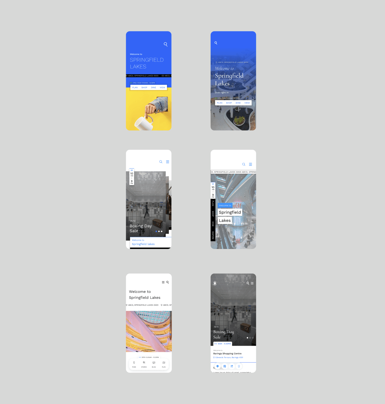
Homepage new look concepts
It was here that I learnt about page narratives and how it basically bypasses the idea of low fidelity wire-framing if you had a design system in place. It blew my mind that we could work like this. The load of page narratives were split between myself and the lead designer
BLOCKERS
Whilst eager to start jazzing up the experience, our initial workshop was rocky. Clients, unfamiliar with our style of workshops, felt rushed which hindered session productivity. They were also unfamilliar with some design concepts which added time for me to explain further
1.
Sending agendas, tasks, reminders, and feedback requests to the client prior to our meetings to avoid delays.
2.
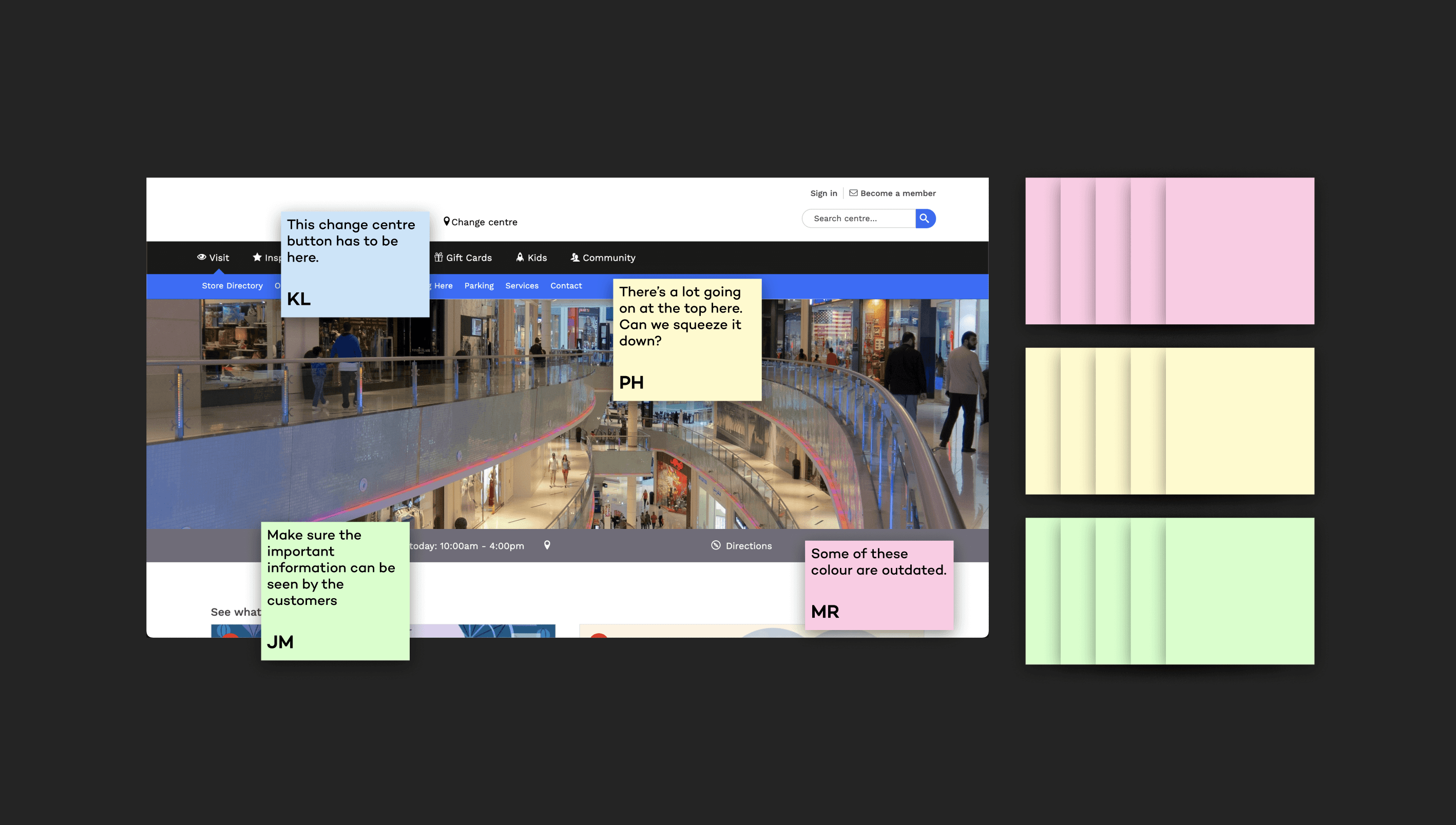
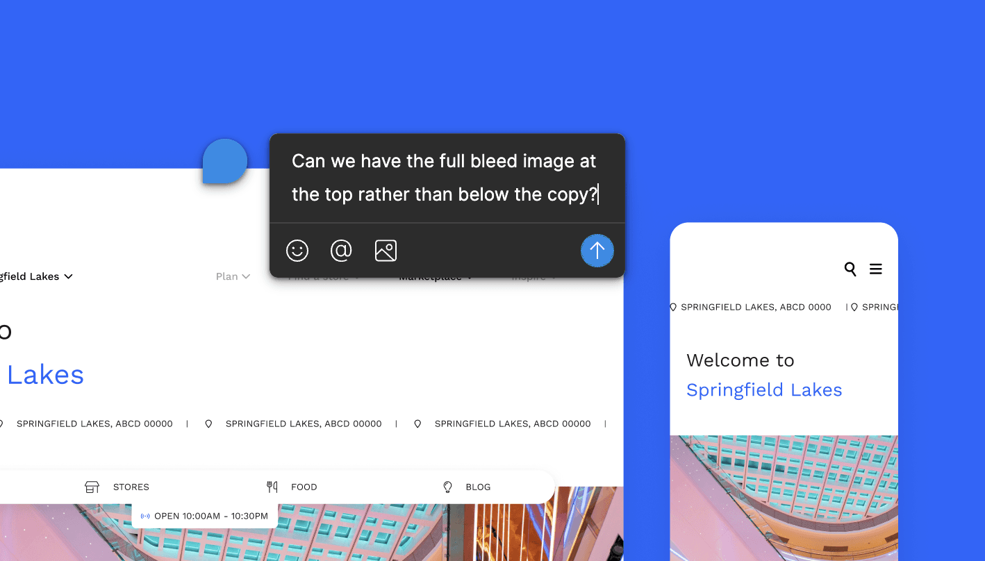
Utilizing the Figma comment system effectively, allowing stakeholders to provide input at their convenience, especially if they encountered difficulties during sessions.
OUTCOME
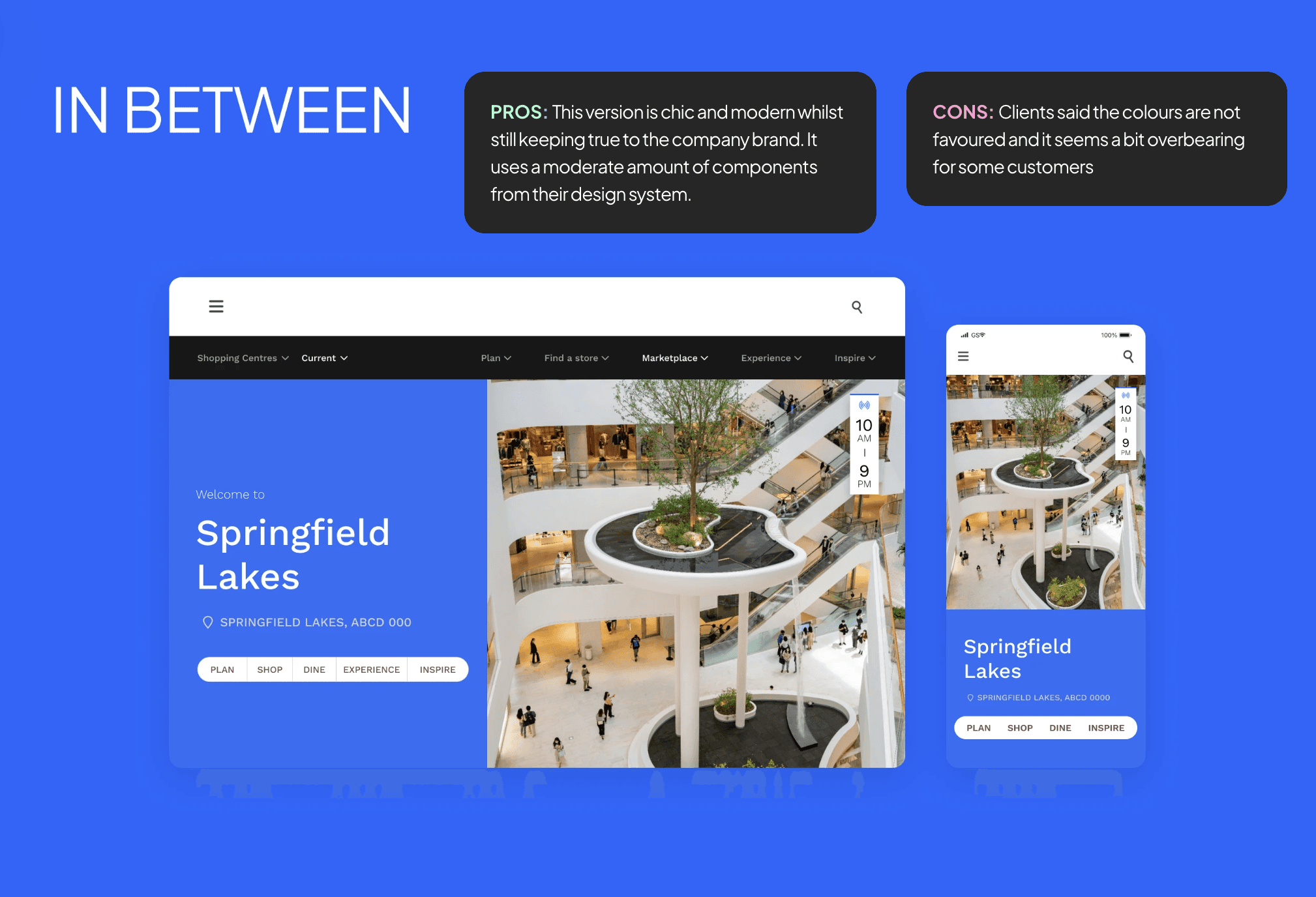
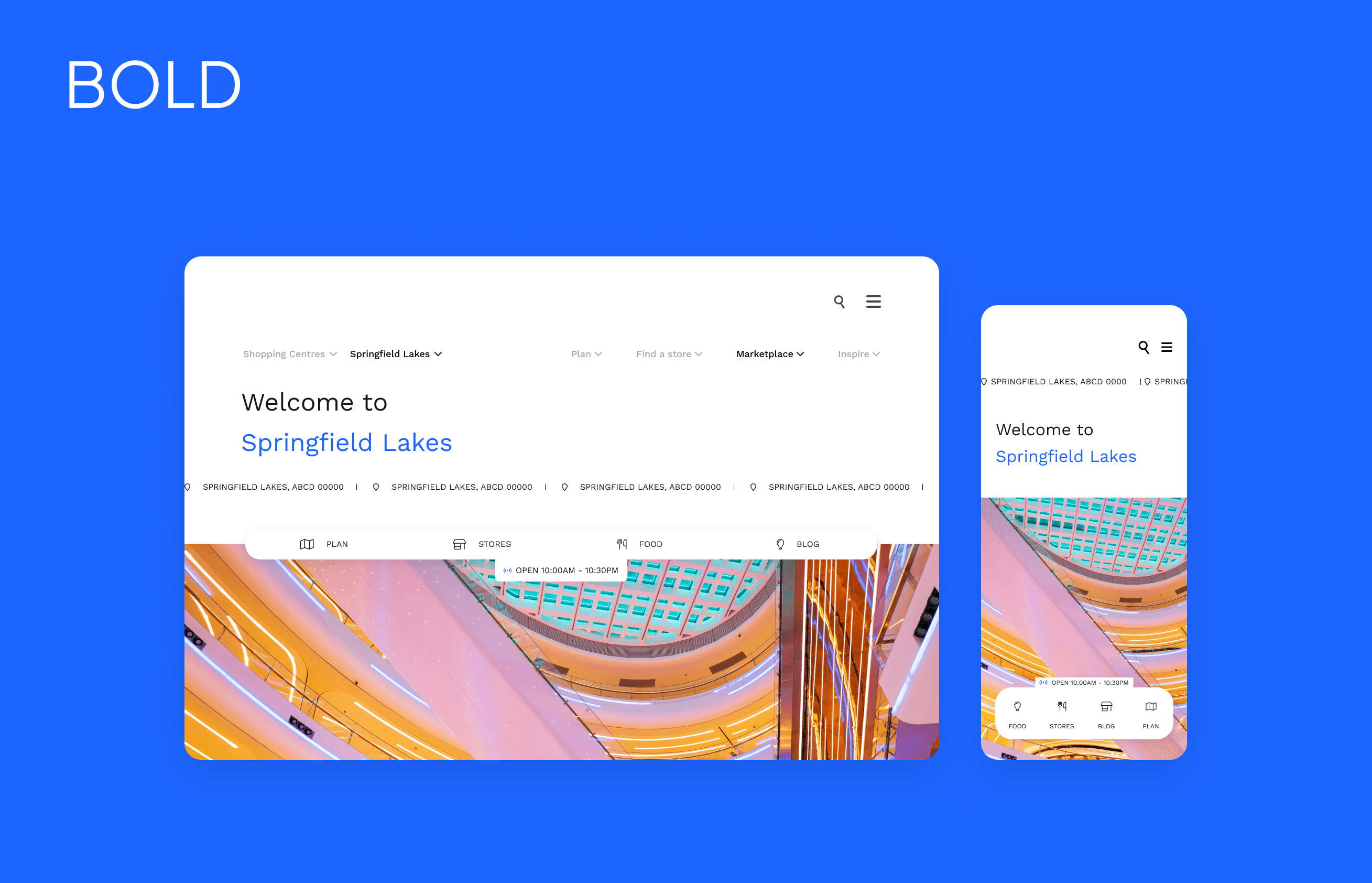
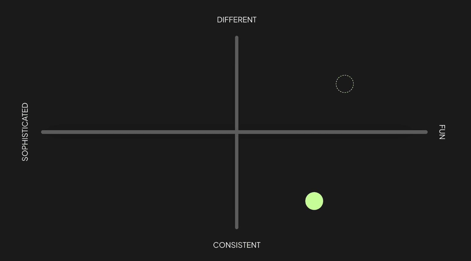
Blocker 2: Perception of the initial direction was off the mark.
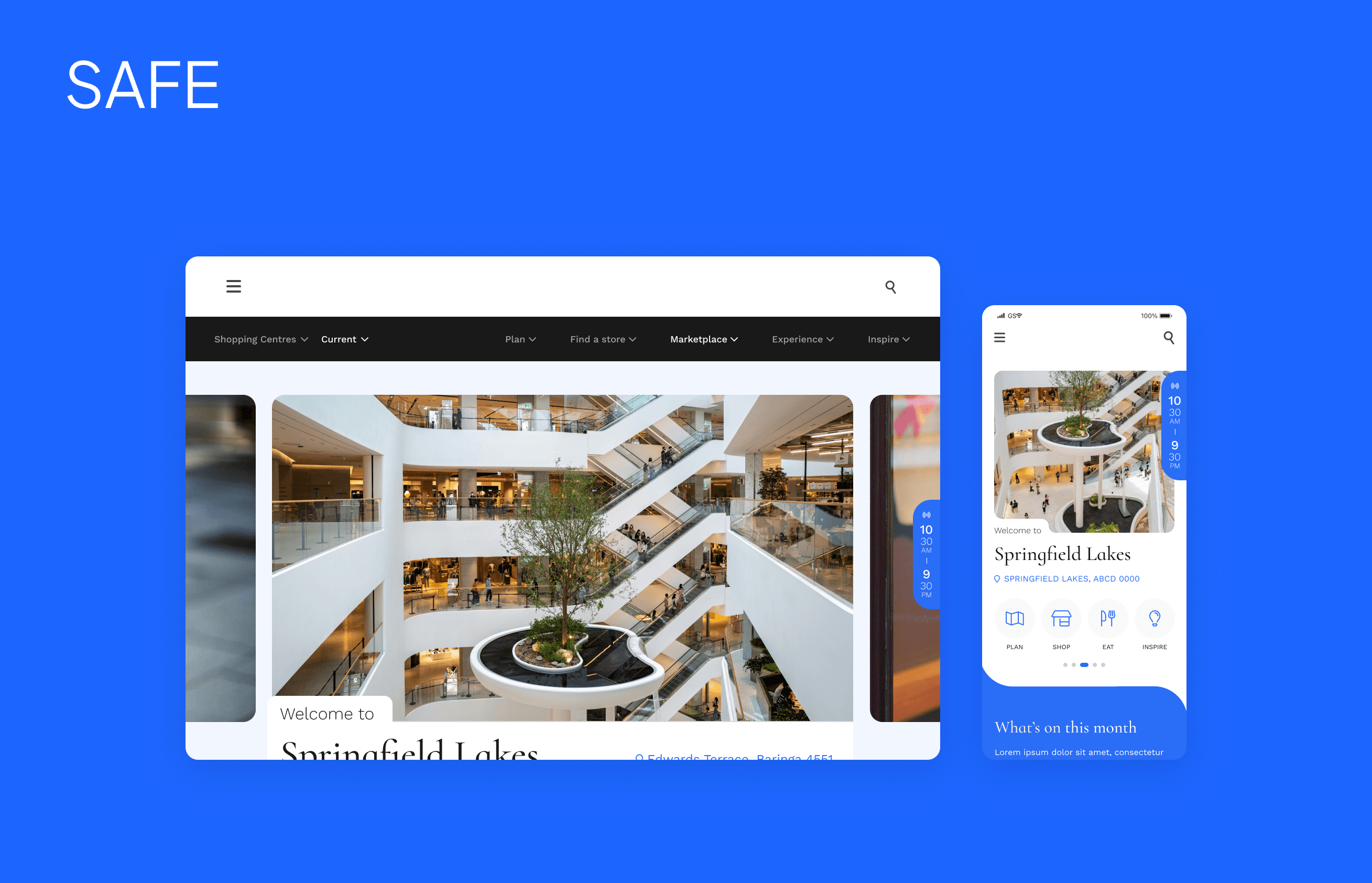
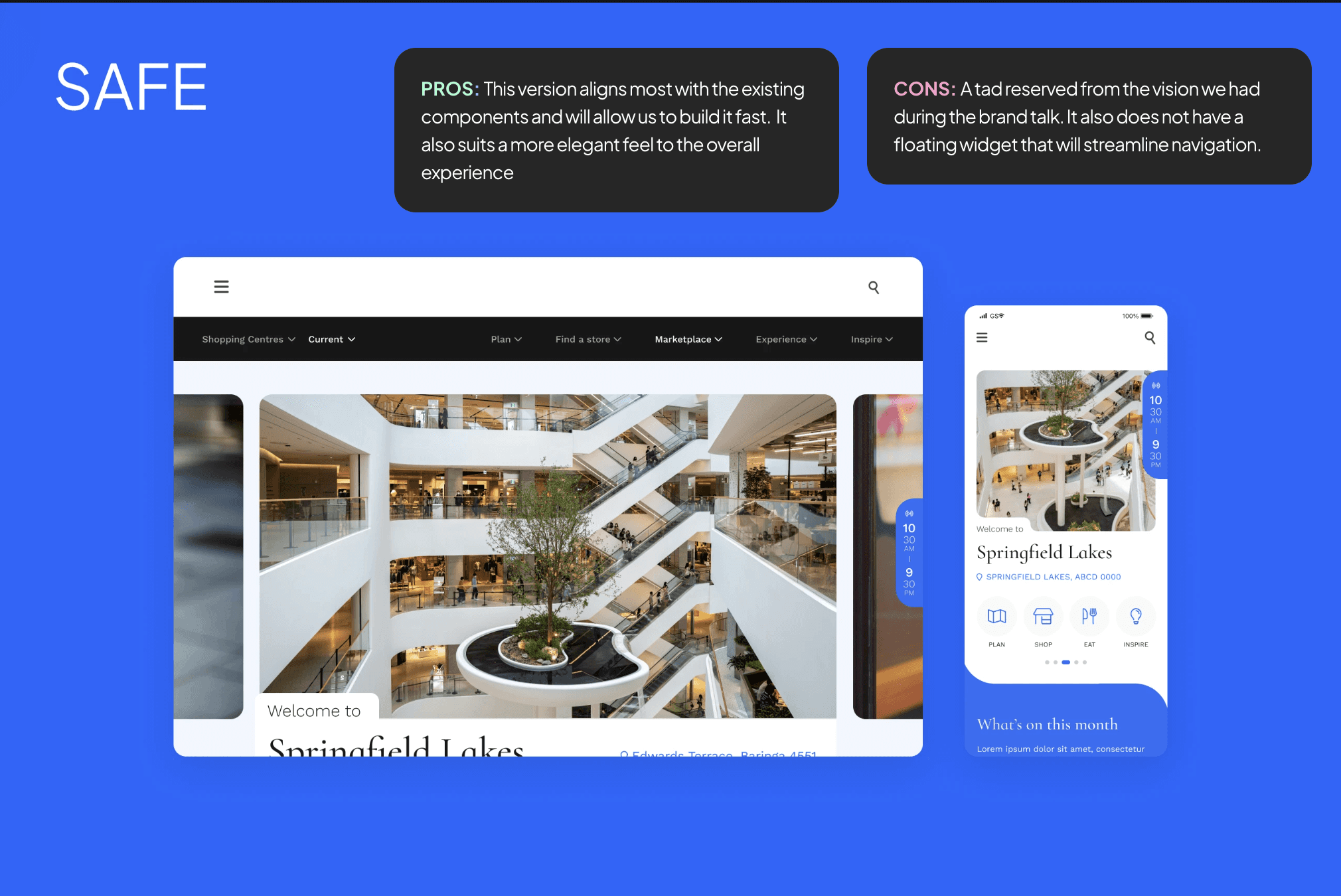
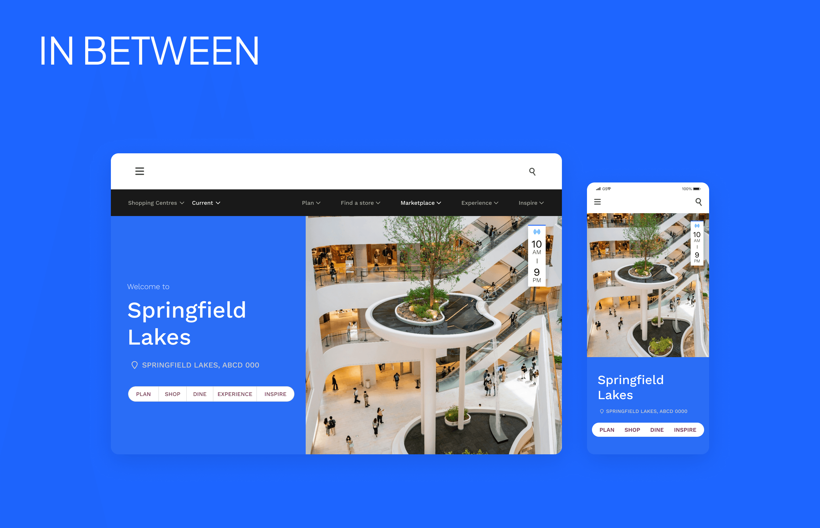
They didn't dislike any of the designs, more so they even praised that we gave them three options to choose from. However the head of brand said that the bold designs are Too bold and worried about the overall accessibility and new colours from the bolder versions. Worst case there are also development constraints we needed to worry about.
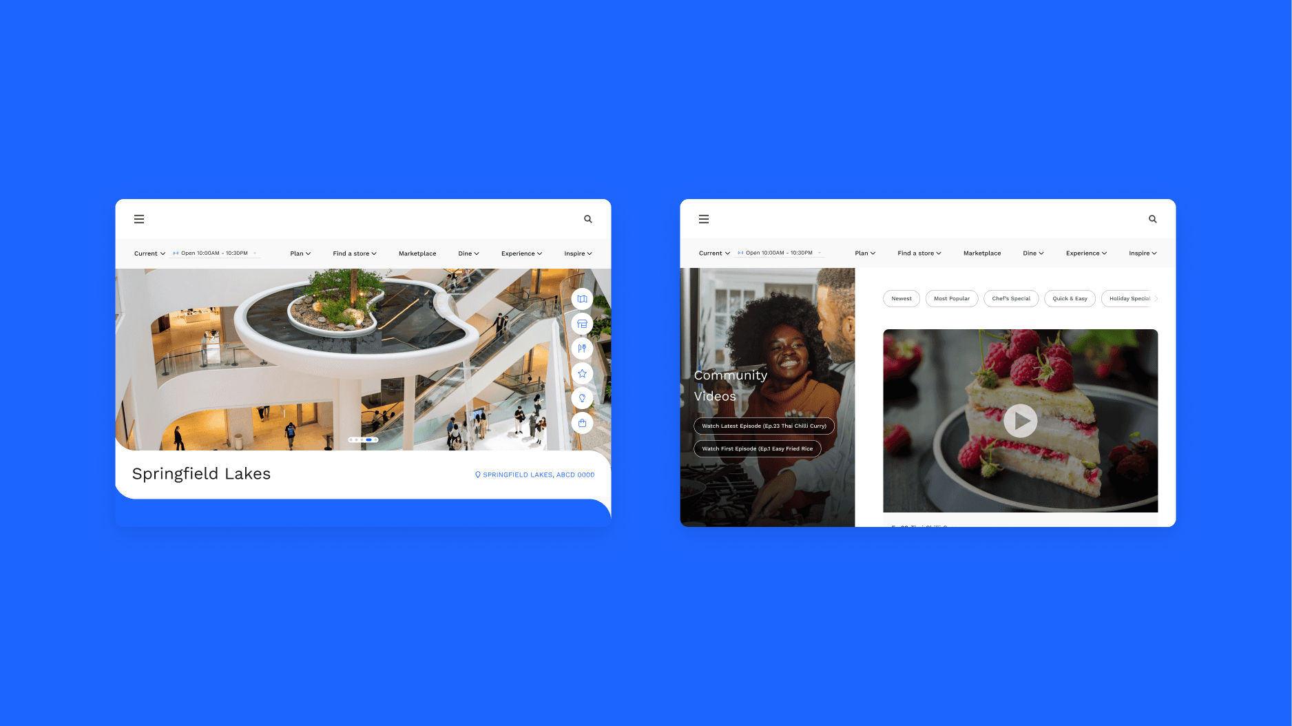
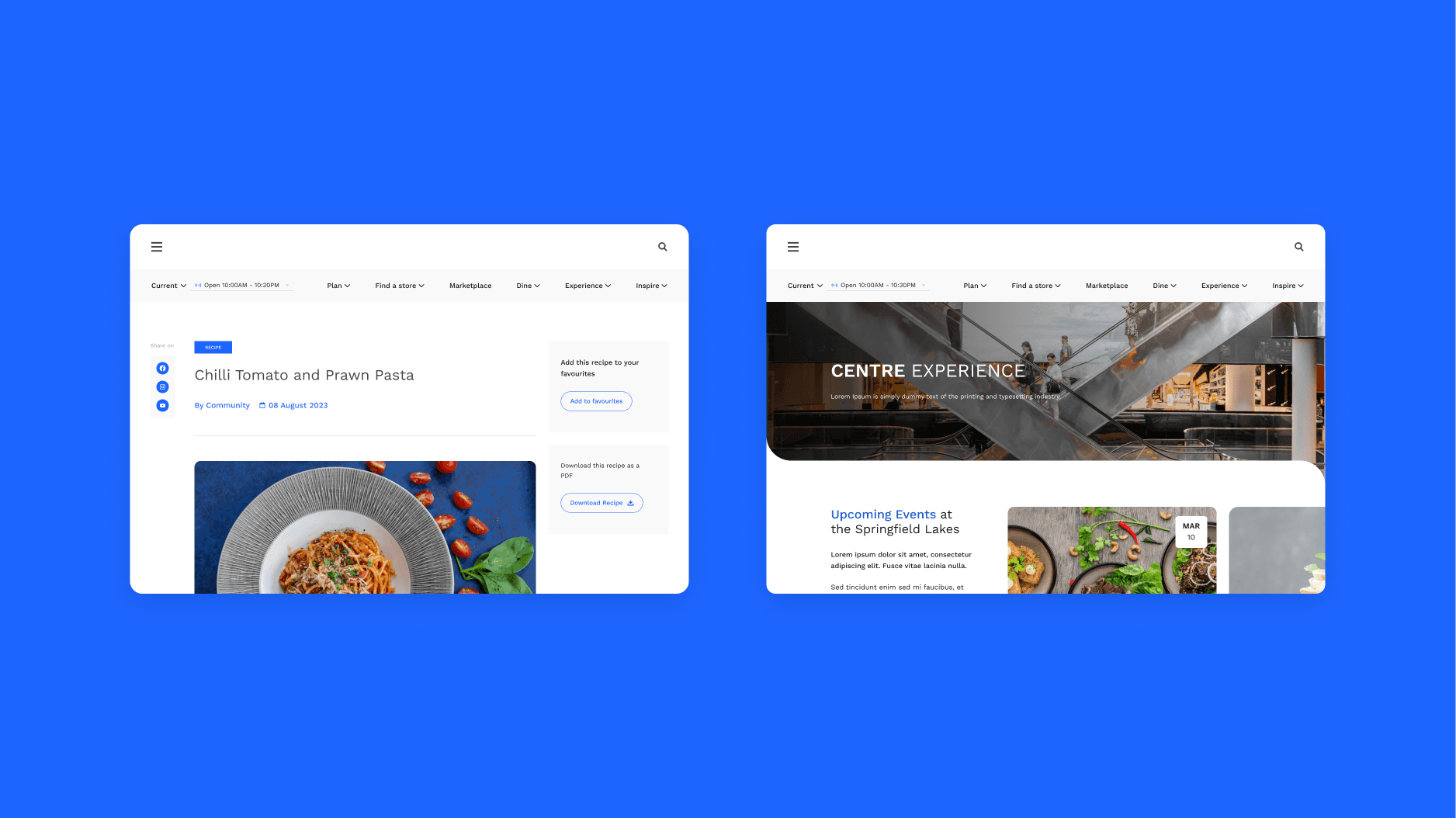
Once we got the green-light for the final concept direction, myself and the lead designer split the workload for the pages and below are the pages and interactions that I have made.
OUTCOME
SOLUTION
Final Designs
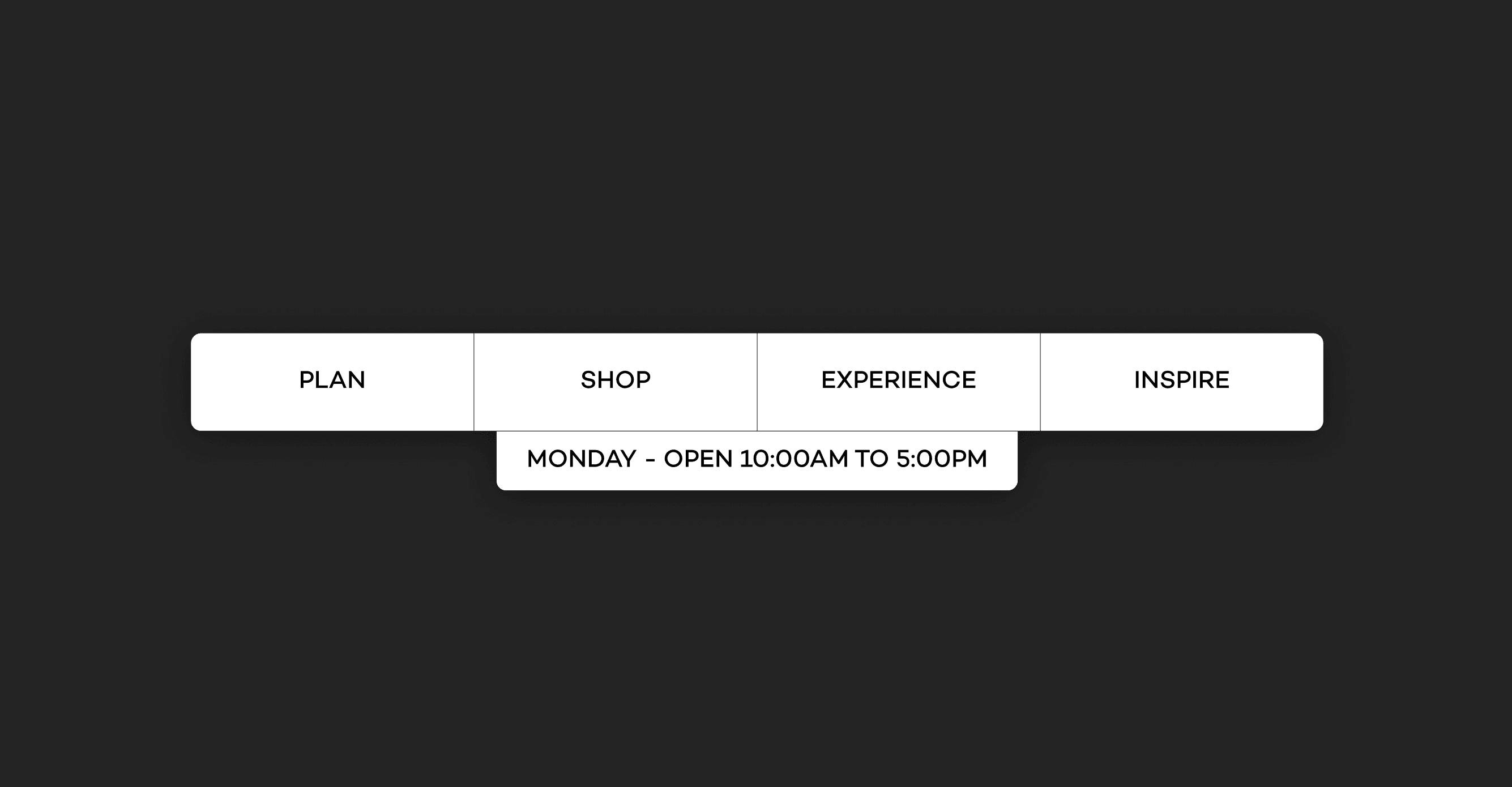
We aimed to make the designs both glanceable and aesthetically pleasing, encouraging users to spend more time exploring the site. Crucial information was made easily accessible through a sticky menu and opening hours.
The stakeholders praised the new experience, which addressed all desired changes, including the incorporation of the new brand identity, intuitive navigation, and enriched content offerings. Despite the challenges faced, the project concluded on a positive note.
Chic and brand aligned design: The websites new design adopts a clean look that reflects a new brand Identity and familiarity.
Simple and intentional navigation: Users now explore with a goal in mind, able to access crucial information in mere seconds.
Engaging and user-first experience: A successful pivot from information to immersion. The experience takes the user on a journey with engaging interactions and intuitive pathing.
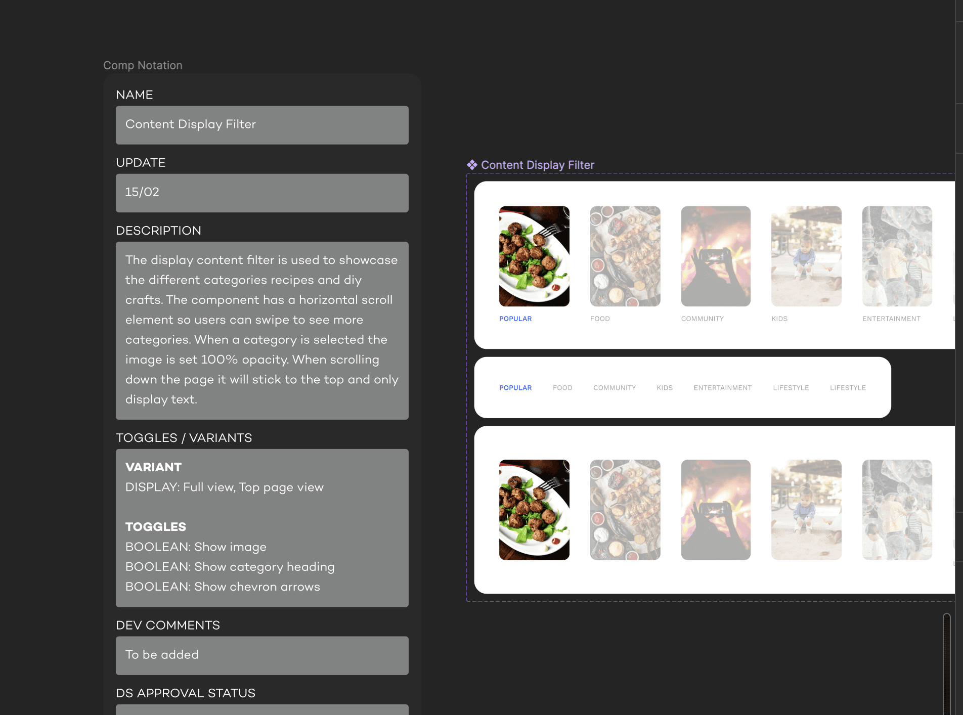
This makes sure devs as well as other designers know how a component works and understands any unique interactions it has. Documenting components will allow for a sustainable design system that is scalable and dev-friendly.
The project outcome was an uplifted digital retail experience that eased the navigation of 150,000 annual shopping centre visitors.
OUTWARD RESULTS
Ask
Already making waves - informal testing showed an increase in 1.5x navigation speeds
From the analytics stakeholder tested with a few members of the company and showed at least 1.5x faster to get to information that was given.
INWARD RESULTS
Ask
Build time for the website will shorten by 1 week because of component reusability.
The developers projected they'd be able to implement the changes faster because the final designs were similar in looks to their other sector websites with the same components
RETROSPECTIVE
Some key takeaways
Post project I had a retrospective on the project where I asked the lead designers and project managers for feedback and what I can do better. Overall it was positives with some improvements requests around things that can be easily fixed.
Leverage Existing Work:
Utilising elements already in the design system saves time, ensures consistency, and minimises duplication of effort.
Take your time don't rush:
During the workshops it is best not to rush the stakeholders and when explaining your reasonings it is okay to take your time.
Adapt to different ways of working:
Recognise and accommodate varying work styles and levels of familiarity with concepts to ensure effective collaboration.
Attention to detail:
Thoroughly check and communicate requirements to avoid rework and ensure execution is precise.
Thanks for reading!!!
NEXT CASE STUDY
ADOBE PRODUCT CHALLENGE

